

Inknoda tee: Stay Gold Stay Thrill
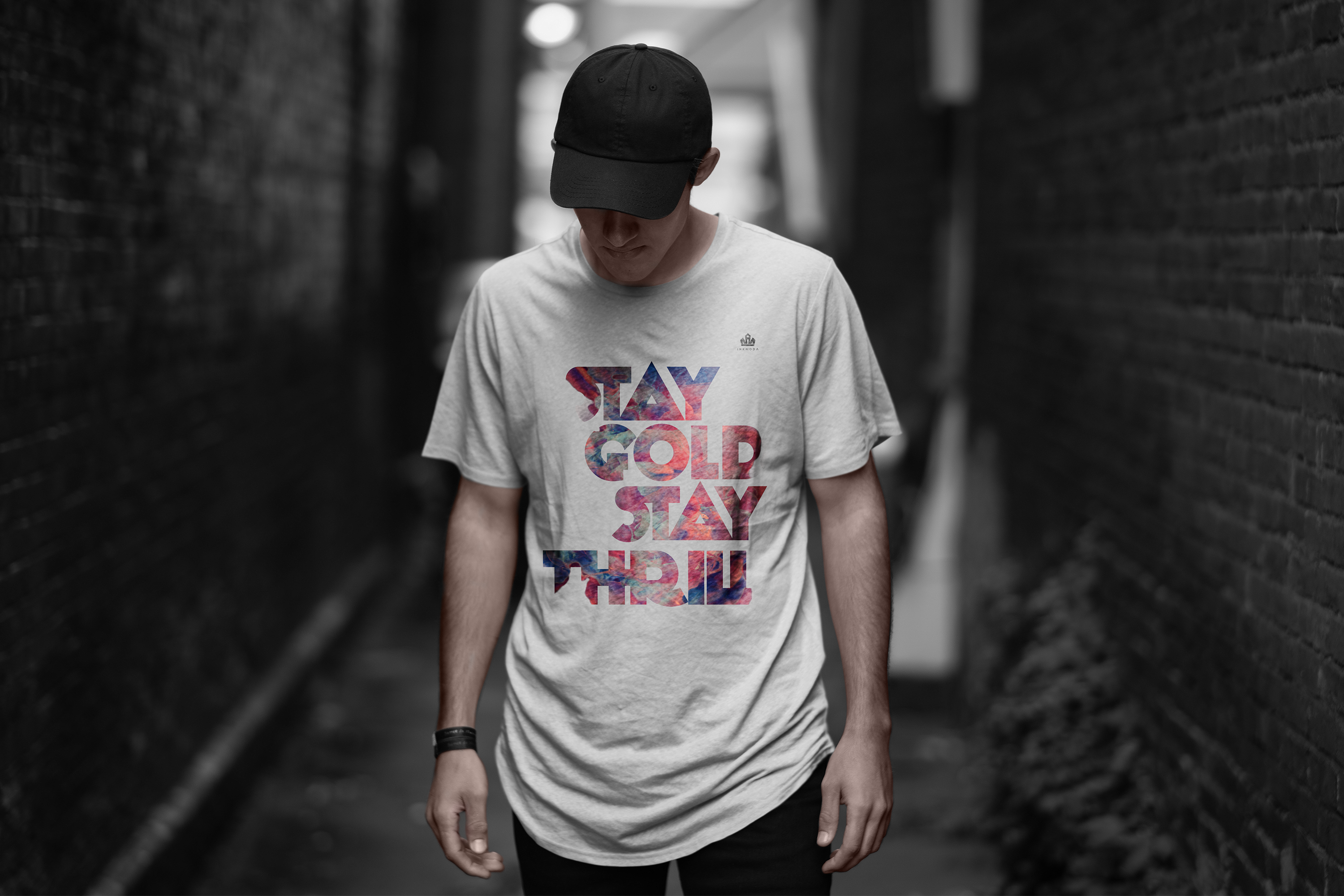
Long silhouette tee for the Inknoda apparel line. STAY GOLD STAY THRILL set in a heavy display face with a nebula watercolor gradient masked inside the letterforms. The type itself is the color story.
Gradient fill inside typography is one of the oldest tricks in graphic design and one of the hardest to make land well. The reason most attempts fail is that the gradient is too soft or the type is too thin, so the color just muddles. This piece uses a heavy display cut so the letterforms hold enough surface area for the nebula to actually read as a nebula, and the palette (magenta, teal, purple, orange) is saturated enough to survive DTG print without going flat.
Type decision
Heavy display sans stacked in three rows (STAY / GOLD STAY / THRILL) creates a rectangular composition tall enough to work on the extended silhouette. Rough edges on the cuts add a hand feel and let the nebula bleed at the corners so the image reads as one continuous surface.
Nebula fill
Original watercolor painted in Procreate with saturated magenta and cobalt bases, orange highlights, and deep purple pockets. Compressed and masked inside the letters at the exact scale where the color transitions happen at letter boundaries, so each word reads as a distinct color moment.
Wearer context
The design is loud on purpose. Meant for the streetwear buyer who wants a piece that carries the outfit rather than sitting neutral. Photographed in a dark urban alley to show the piece competing successfully against a busy environment, which is the real world use case.
Production notes
DTG (direct to garment) print on 100 percent cotton long silhouette crew, heather white ground. High saturation press to hold the gradient depth. Crown mark upper left chest at small scale for brand attribution.
Interested in similar apparel or typographic work? Tell me what you are trying to move.
Start a conversation