

Inkgility triangle pattern stationery
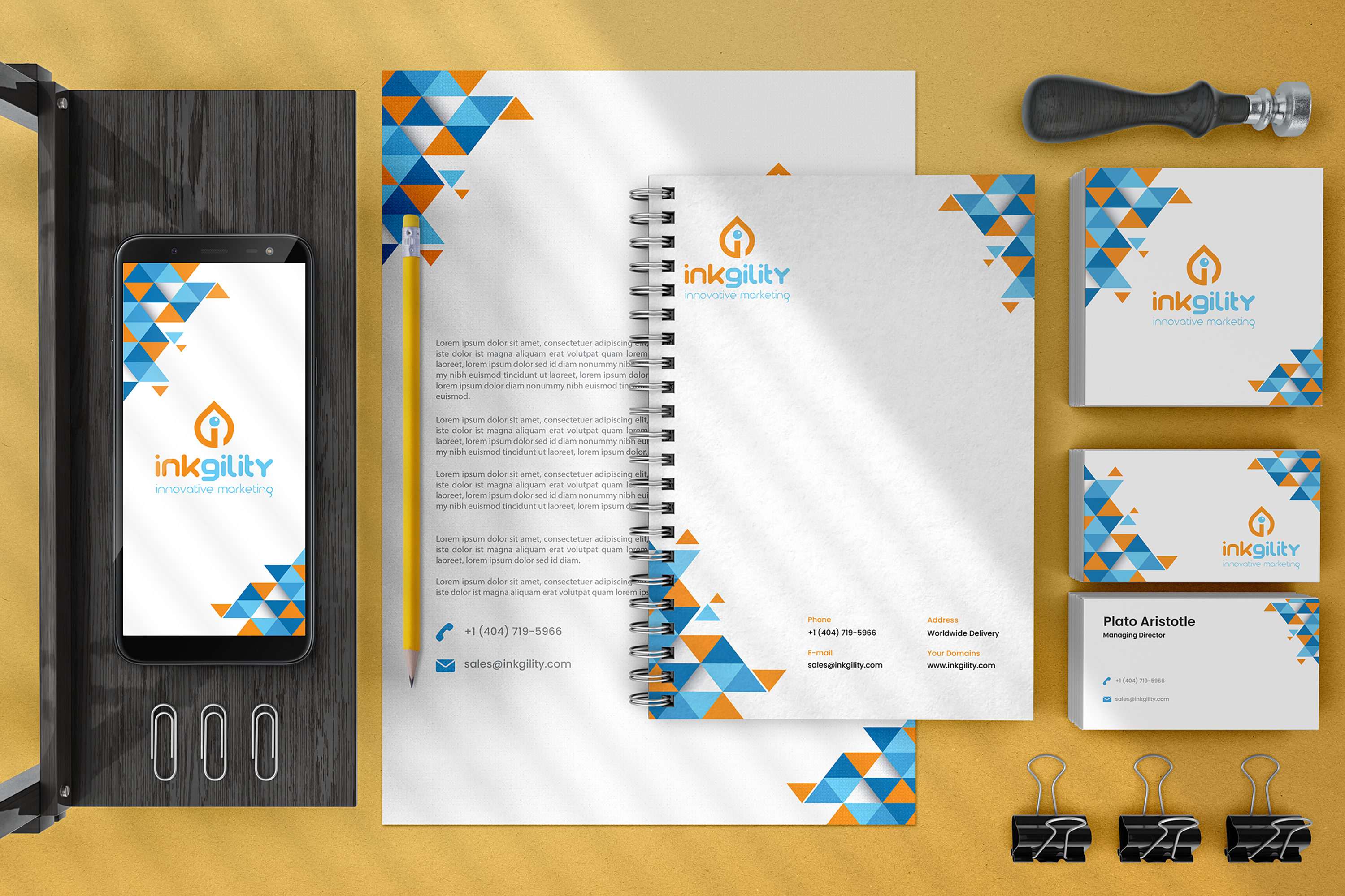
Bright treatment of the Inkgility system built around a blue and orange triangle pattern that stitches across letterhead, notebook, envelope, business cards, and the mobile splash. The pattern reads as movement, which pairs with the meaning inside the wordmark.
A brand system that only lives in dark and premium treatments will feel one note in category work where the audience expects energy. This treatment is the bright counterpart inside the Inkgility identity library. Same mark, same wordmark, same voice. Different palette and pattern layer for the kind of brand touchpoint that needs to move faster and read louder without giving up structure.
Pattern architecture
The triangle tile builds a corner cluster that migrates across the piece. Larger blue triangles anchor the composition, smaller orange triangles carry the motion. The pattern always reads as a system, not confetti.
Color logic
Cyan and orange sit at complementary positions on the wheel, which gives the pattern its energy. The white ground plus the yellow photography backdrop pushes the pieces forward and keeps the composition legible even at thumbnail scale.
System coverage
The pattern lives on letterhead corners, notebook covers, business card corners, and the phone splash. Deliberately not on the envelope in this shot, which keeps the correspondence piece calm while the interactive and note taking pieces carry the energy.
Production notes
Letterhead on smooth uncoated 120gsm. Notebook cover offset print on matte laminate with the pattern rolling from corner to spine. Business cards on heavier stock so the pattern edges hold sharp. The phone splash asset is the digital equivalent of the printed corner, sized for iOS and Android splash specs.
Interested in similar pattern or stationery work? Tell me what you are trying to move.
Start a conversation