

Inkgility logo mark construction
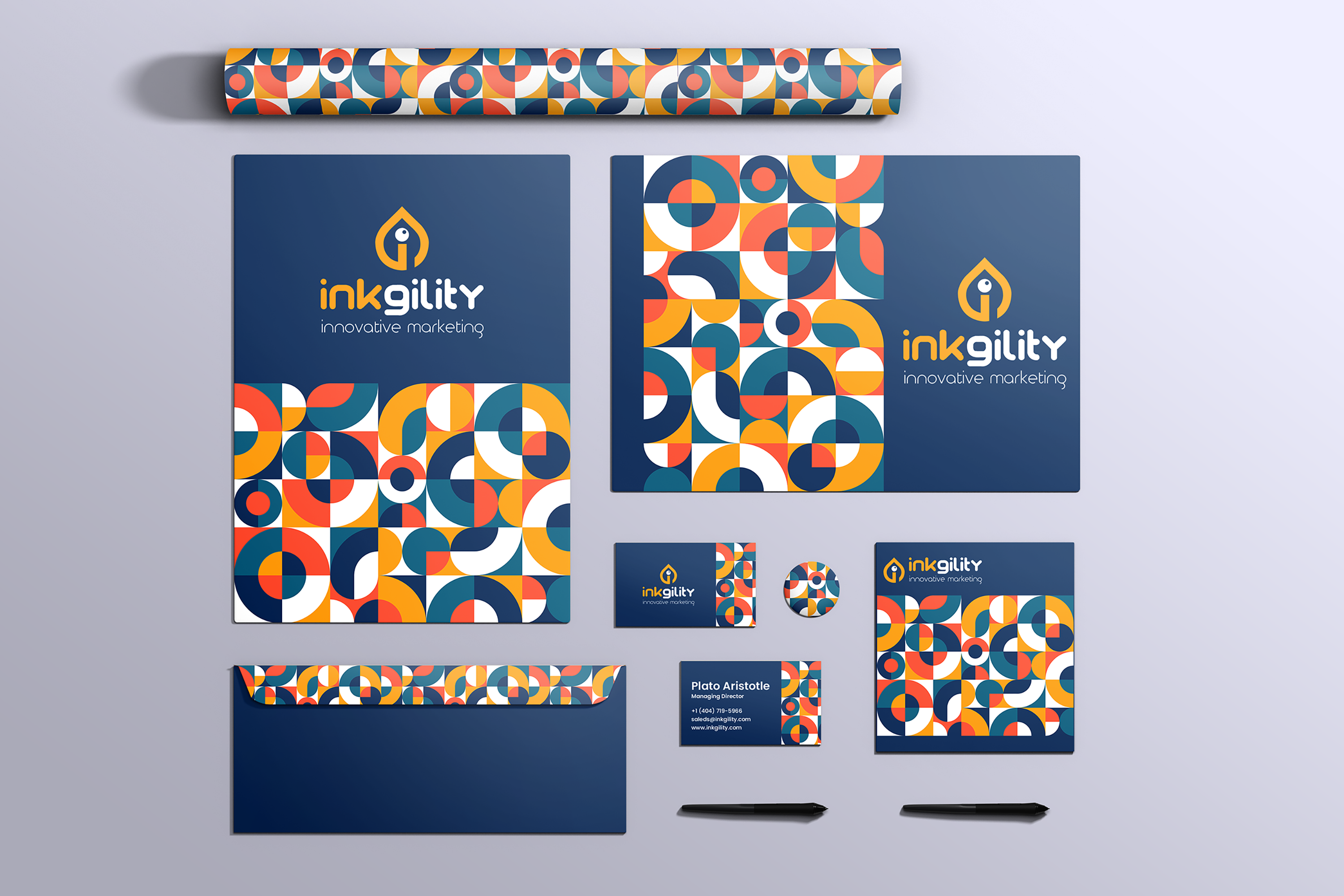
The Inkgility mark as construction geometry. A drop shape with an inset counter, built on a grid so every curve resolves against a defined center. Presented on the drafting surface where the mark was worked out, alongside the tools that carried it from sketch to production.
Every mark that scales cleanly is built on geometry that can be redrawn from memory. This piece shows the Inkgility mark at the construction stage: a droplet silhouette resolving into an inset circle counter, with a small stroke on the vertical that anchors the mark inside its optical square. The lines that extend past the shape are the grid the mark was designed against, kept visible so the underlying structure is legible.
Construction logic
The mark sits inside an optical square with a defined center point. The droplet silhouette rides a diagonal, the counter is a true circle offset to the right of the mark's midline, and the vertical stroke stops short of the baseline to give the composition a small internal pause.
Why the drop
Inkgility carries the word ink. The droplet shape reads at first as a paint drop, which puts the buyer in the right category before they process the wordmark. It is not the most inventive shape choice in the category. That is on purpose. Category leadership marks earn their durability by being unmistakable, not clever.
The counter
An inset circle carves a lowercase i into the drop when the eye resolves it a second time. The mark performs at two depths: a droplet on first pass, a letterform on the second. That double read is what makes the mark durable across scale.
Application context
The mark is designed to hold at favicon scale, at business card scale, and at signage scale without losing its underlying geometry. The construction sketch shown here is the reference document that governs every downstream application.
Interested in similar mark work? Tell me what you are trying to move.
Start a conversation