

Inkgility holographic stationery
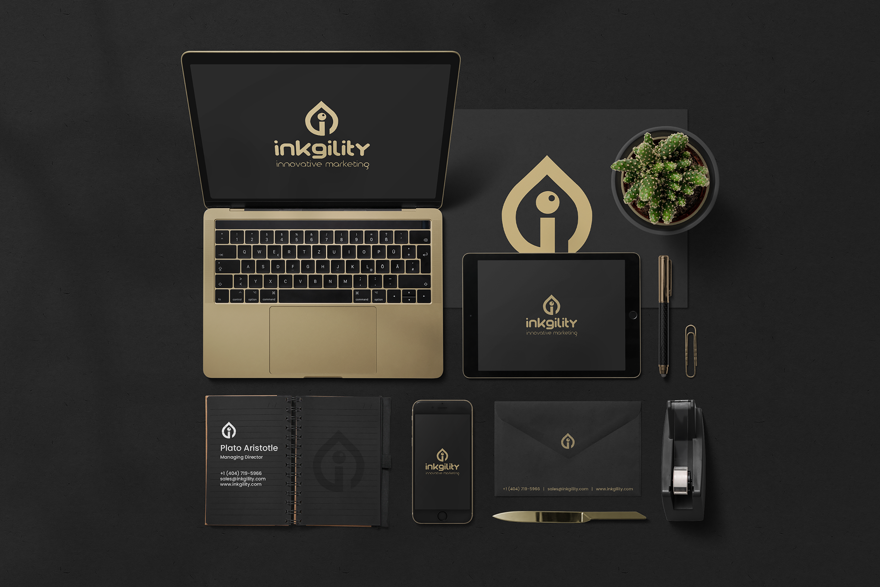
Complete stationery system in the Inkgility holographic treatment. A cyan to magenta gradient with subtle world map imagery grounds the identity in a more expressive register than the dark treatment, without abandoning the charcoal ground.
A brand identity system does not have to be a single treatment. The stronger identities carry two or three treatments that share a mark, a wordmark, and a set of ground rules, so the brand can move register from a boardroom deck to an event flyer without breaking. This is the second treatment inside the Inkgility system, a holographic gradient application layered on the same charcoal ground and paired with the same mark. Different feel, same identity.
Palette decision
Cyan and magenta gradient reads as digital native without leaving the premium ground. The gradient stops are placed so the transition happens at the edge of each piece, which gives the pieces internal movement when they sit next to each other on a desk.
Imagery layer
A soft world map illustration lives underneath the mark on the notebook, envelope, and stationery. Reads as reach and scale without a headline claiming either. The map is designed to sit at low contrast so it becomes a texture layer, not a subject.
Poster as extension
The Arte Mode poster is a system extension piece, produced to show how the identity moves from stationery to event or campaign work. The bars reference the gradient stops from the envelope. Same palette, different application.
Production notes
Foil printed gradient on soft touch charcoal stock for the business cards. Envelopes printed with the gradient on the flap only, so the piece reveals the color when opened. Notebook cover foil embossed with the mark and the map layer. The system is one of two directions in the Inkgility identity library, paired with the dark treatment for register variety across use cases.
Interested in similar stationery work? Tell me what you are trying to move.
Start a conversation