
Inkgility gold + green letterhead
A premium letterhead system in gold and deep green with organic corner shapes that carry the brand into the paper without dominating the copy space. Letterhead, envelope, and business card, photographed with a real magnolia leaf as a nod to the natural palette.
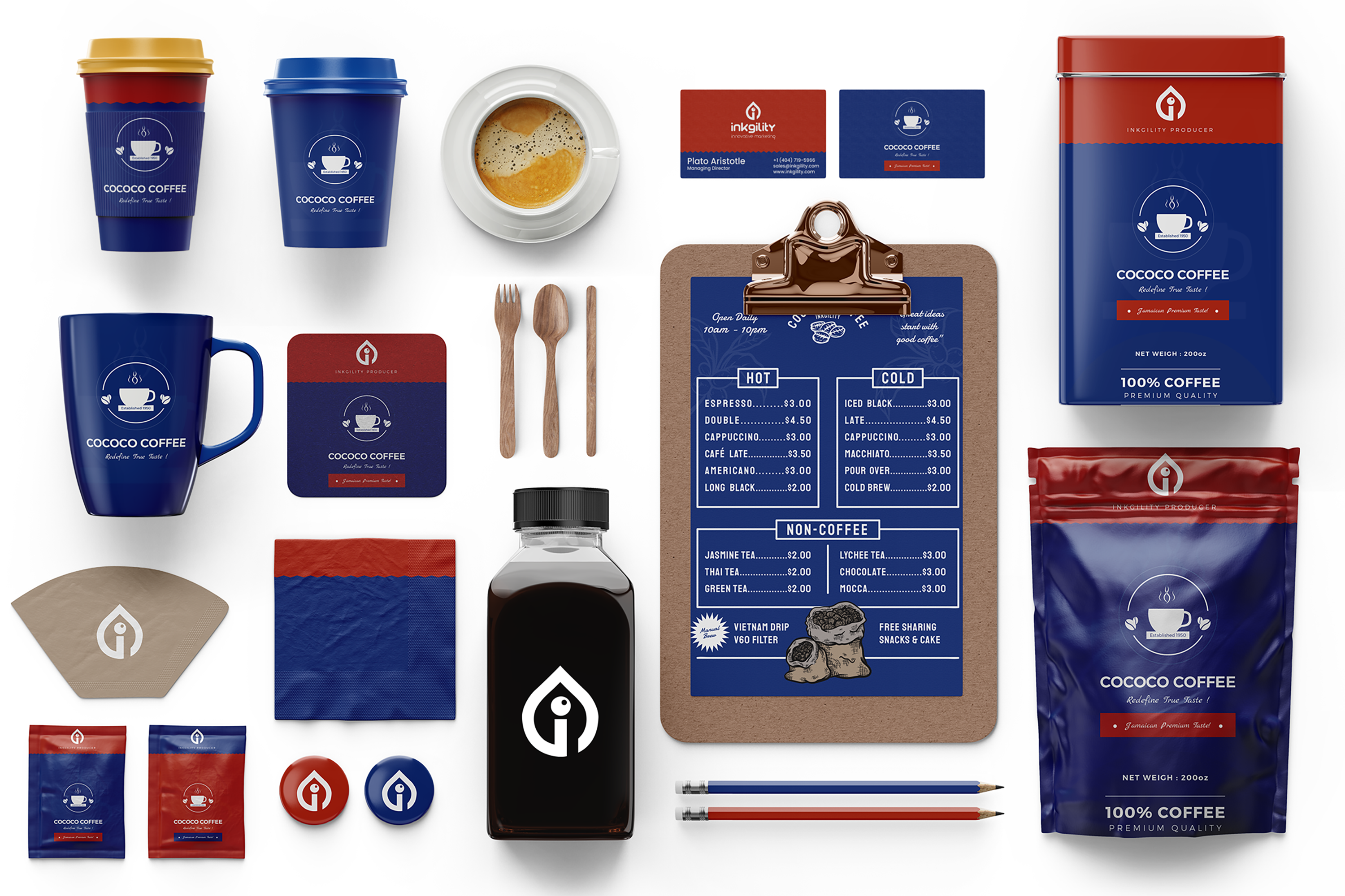
This treatment sits inside the Inkgility identity library as the correspondence variant. The dark and holographic treatments carry the brand into marketing and event work. This one is for actual letters. Every design decision was made against the reality that the client will fold the paper, put it in an envelope, and mail it to someone who has to read a real message inside a real business context.
Corner treatment
Organic green shapes sit only at the top left and bottom right of the letterhead. They frame the message rather than fight it. The gold accent under each green shape carries the brand color into the piece without pulling the eye off the copy.
Envelope discipline
The envelope carries the mark alone, foil printed on the flap. Clean white ground so the address block reads clearly for the mail carrier. The mark is the payoff when the recipient turns the envelope over.
Business card
Warm cream stock with quiet gold accents. The name and title read first, the contact block sits below a thin gold rule. Designed to feel like a card someone gives you at a table, not a card handed out at a booth.
Production notes
Letterhead on uncoated warm white 100gsm. Envelopes on the same stock with matte gold foil for the mark. Business card on 400gsm cotton with gold foil accent and letterpress name block. The system holds up to the everyday correspondence use case it was designed for.
Interested in similar letterhead or stationery work? Tell me what you are trying to move.
Start a conversation