

Inkgility dark stationery
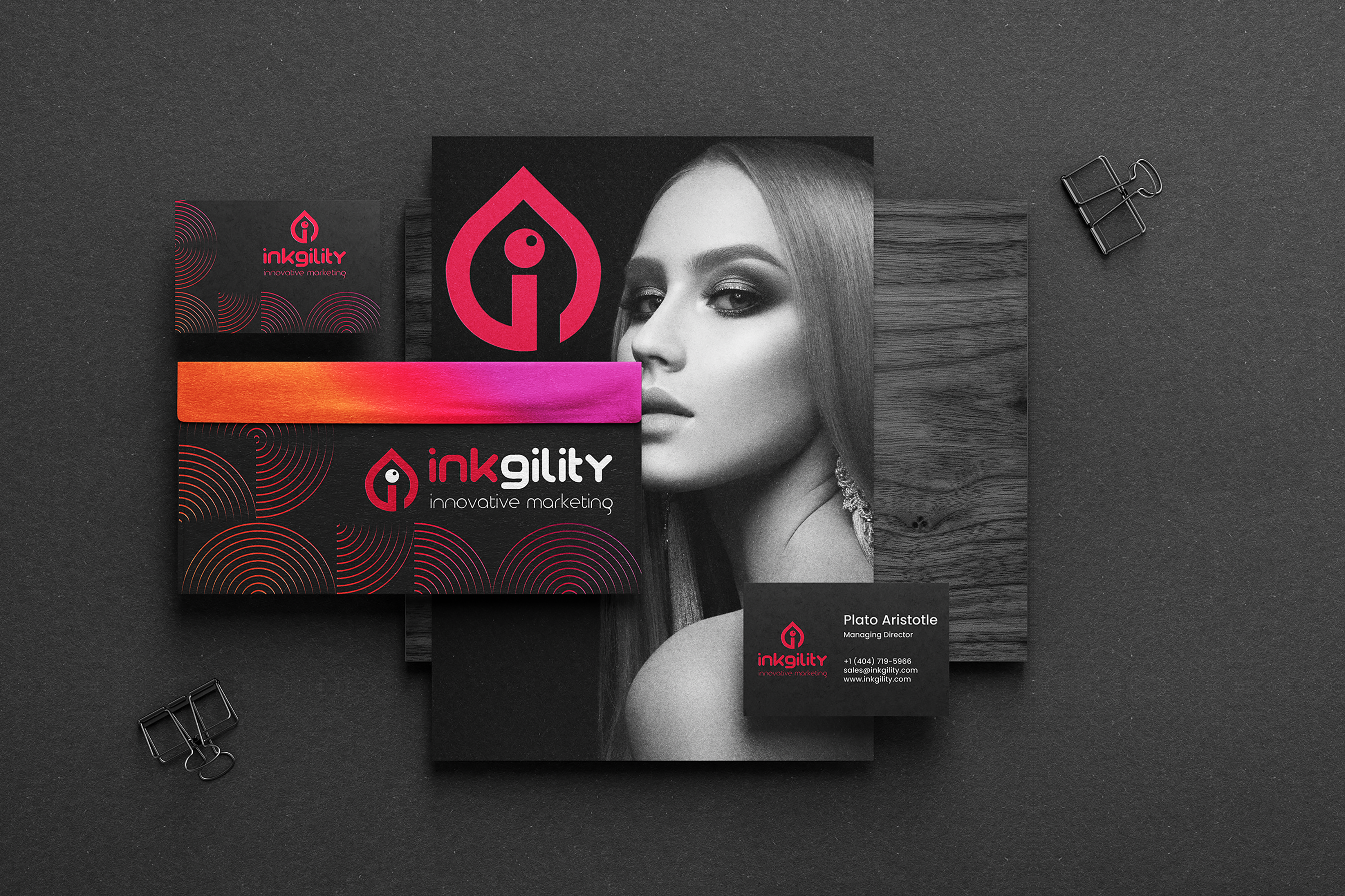
Complete stationery system in the Inkgility dark treatment. Charcoal ground, silver mark, quiet typography. Business cards, folded brochure with chess imagery, envelope, box, and branded ribbon photographed as one composition to show how the pieces read together.
A stationery system is where a brand identity finally has to be produced, not just designed. Paper stock, ink coverage, foil versus print, and how the mark sits on a curved envelope flap all determine whether the brand feels premium or feels like a template. This dark treatment of the Inkgility system was built to hold up on the pieces prospects actually keep: the business card that lands in a wallet, the envelope that arrives at a prospect's desk, the ribbon that ties a package the client will remember.
Palette decision
Charcoal ground with white and silver hits, no accent color. Reads as premium and confident without leaning on a novelty color. Charcoal photographs better than pure black under studio light and holds detail on print without crushing.
Typography
Wordmark in the Inkgility set weight paired with a clean geometric sans for details. Tracking is deliberately open on the business card to give the type room to breathe against the dense charcoal ground.
The chess motif
The brochure carries chess piece photography, which reads as strategy without needing a headline that says the word. Marketing agencies often over explain their positioning. The image does the work.
Production notes
Cards printed on 32pt uncoated black stock with silver foil. Envelopes soft touch black with silver ink for the address block. Ribbon woven silver on charcoal so the mark reads even at low ambient light. The dark treatment is one of two directions in the Inkgility identity library.
Interested in similar stationery work? Tell me what you are trying to move.
Start a conversation