

Glenhouse Studio
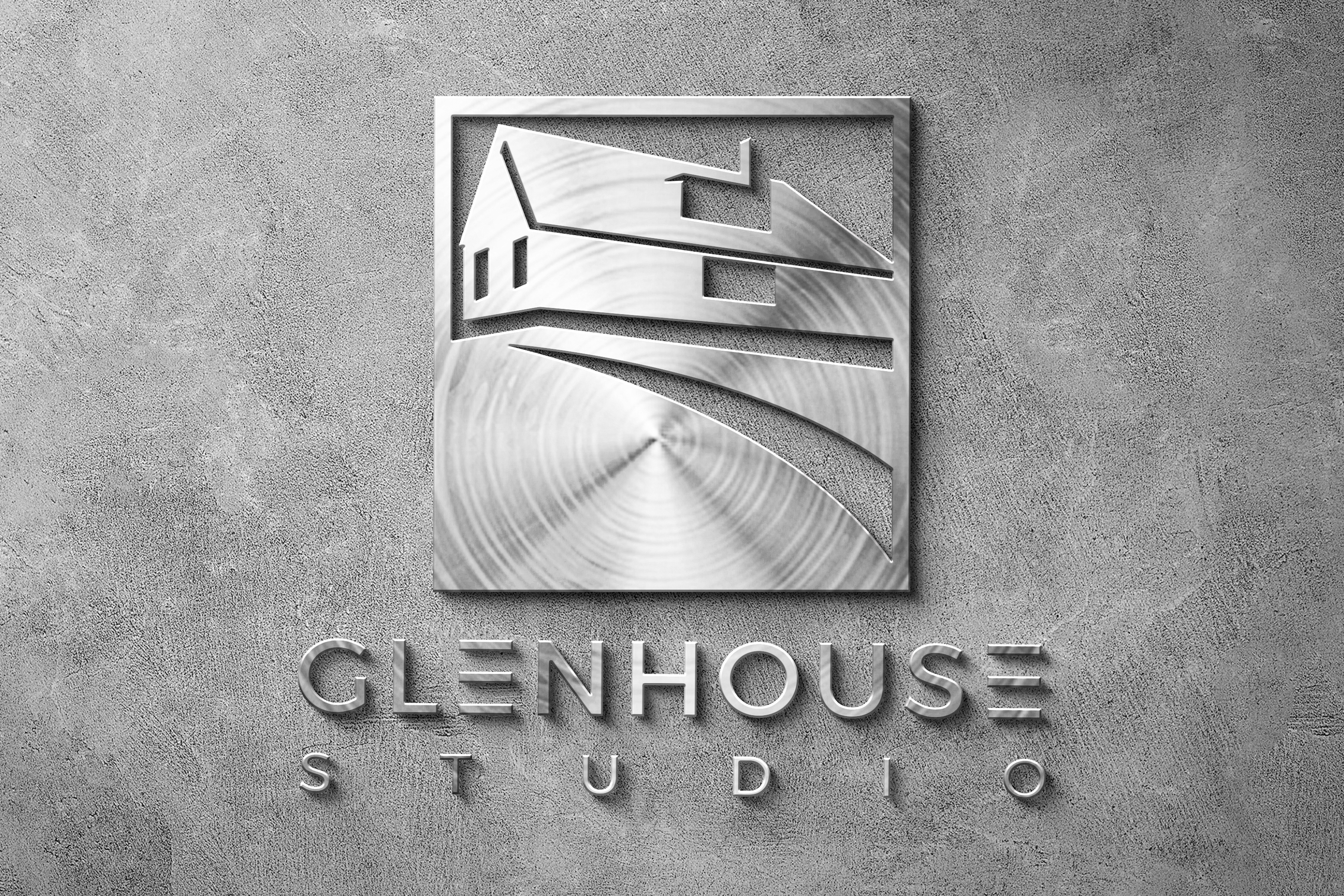
Architectural brand mark. A single glyph carries the roofline, the studio signature, and the perspective of the building rendered in one continuous cut. Presented here on brushed metal signage to show how the mark holds up in a real environment.
The brief for Glenhouse Studio was a mark that could stand on a building without a wordmark next to it. Architecture and studio work both share a visual literacy for shape and negative space, so the mark leans on that: an angular roofline that reads as a house at first pass and resolves into a stylized studio glyph on a second look. The mark works on paper, on screen, and in physical fabrication.
Design decisions
The mark reads at three depths. On a small screen it is a house silhouette. At mid range it resolves into an architectural glyph with a distinct roofline and studio window. At close range the negative space carves a subtle path leading to the horizon, which gives the mark a sense of place beyond the object.
Material treatment
Rendered in brushed stainless steel with a slight bevel, mounted on a concrete surface. The brushed radial pattern was chosen so the mark plays with light differently through the day, giving the signage a living quality rather than a static logo.
Wordmark pairing
Set in a wide sans with generous letter spacing on GLENHOUSE, with STUDIO underneath at a smaller weight and tighter tracking. The size relationship keeps the wordmark subordinate to the mark, which is the primary identity carrier.
Application versatility
The mark holds up across signage, business collateral, print work, digital surfaces, and merchandise. The wordmark can drop when context is clear, which is the sign of an identity system that has done the work upfront rather than relied on the wordmark for recognition.
Interested in similar identity work? Tell me what you are trying to move.
Start a conversation