

Barbershop by Inkgility
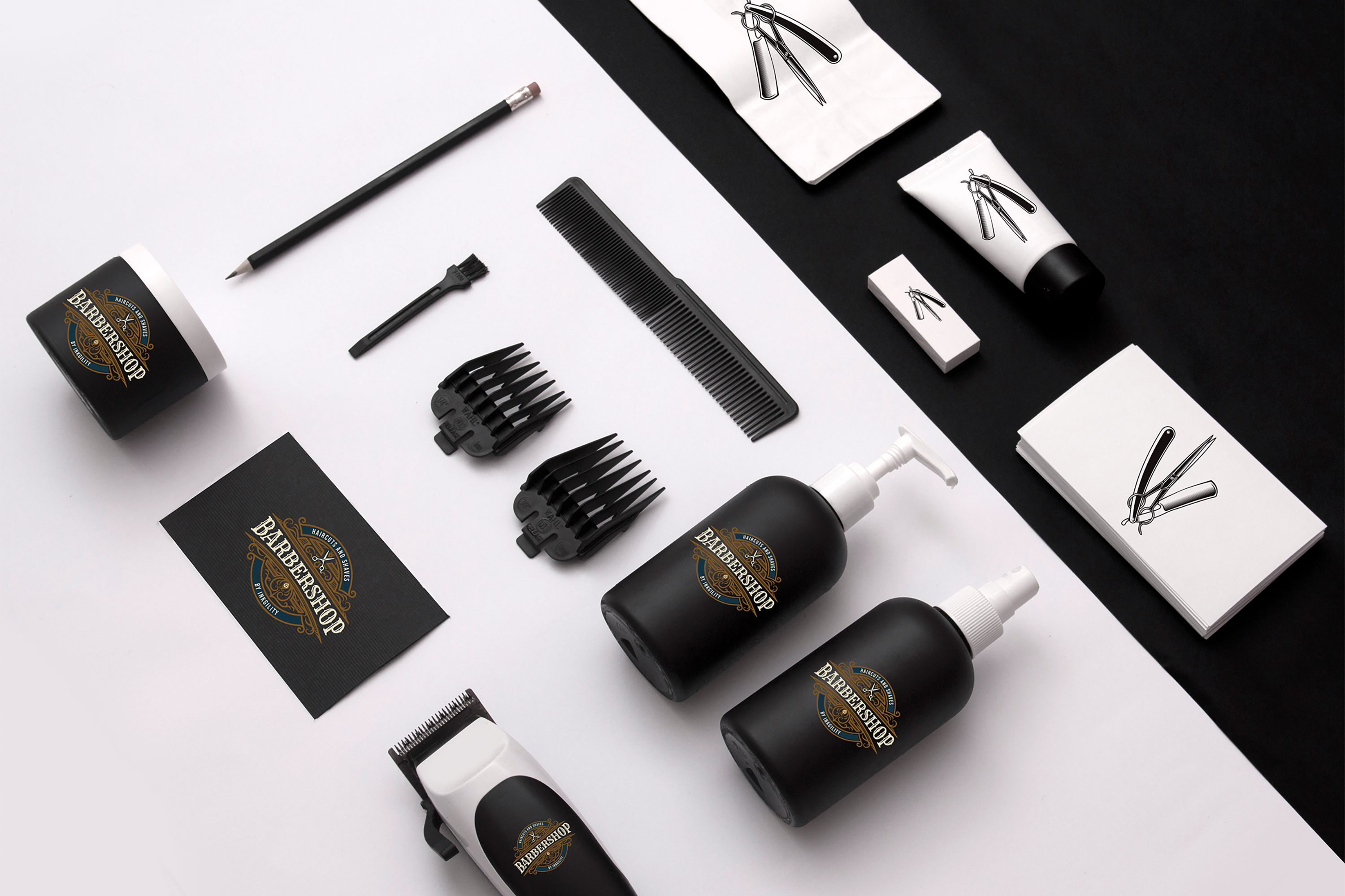
Complete client identity for a modern barbershop concept. Vintage crest wordmark applied across product packaging, tools, business cards, and merchandise, split against a black and white staging to show how the mark holds up on every surface the shop actually uses.
Barbershop identity work is deceptively hard. The category has been designed to death, so any new mark has to compete against a century of visual reference (barber poles, scissors, straight razors, ornate wordmarks). The trick is to use the category vocabulary rather than fight it, then apply the mark with enough discipline that the shop feels like a single confident business rather than a mood board. This client system carries the vintage crest cleanly across every physical touch point that a customer sees between walking in the door and paying at the counter.
The crest
Vintage crest wordmark with a scissors and razor motif inside an ornate frame. The type sits in a heavy display style so the mark reads at counter distance. Brass accents replace the traditional gold to keep the crest premium without leaning old fashioned.
Illustration counterpart
A cleaner line illustration of scissors and razor lives on the smaller product surfaces (tube, spray, small package). The two versions of the mark share the same core tools drawn in the same weight, so the customer reads them as the same brand at different scales.
Product packaging
Matte black bottles with the crest in brass, paired with matte white on the smaller surfaces. Split ground photography (half black, half white) shows the system holding up on both value sides, which matters because the shop retails product in both a light and dark shelf environment.
Tools and merchandise
Clipper wrap, comb, small package, and business card all carry the appropriate mark for their scale. The system was designed to be produced in small batches by the shop owner over time, not as one large launch print run, so each piece can be reordered independently without redesigning the whole system.
Interested in similar identity or packaging work? Tell me what you are trying to move.
Start a conversation