

Marqee is a career concierge. A real strategist finds the roles, runs recruiter outreach, and submits every application on the member's behalf, so a job seeker lands interviews without spending nights refilling forms. The brand runs on a theater marquee metaphor: get top billing, name in lights, be the headliner. Human first, process second, software in the engine room. What follows is pulled directly from the production system at marqee.com, not a mockup.
Wordmark
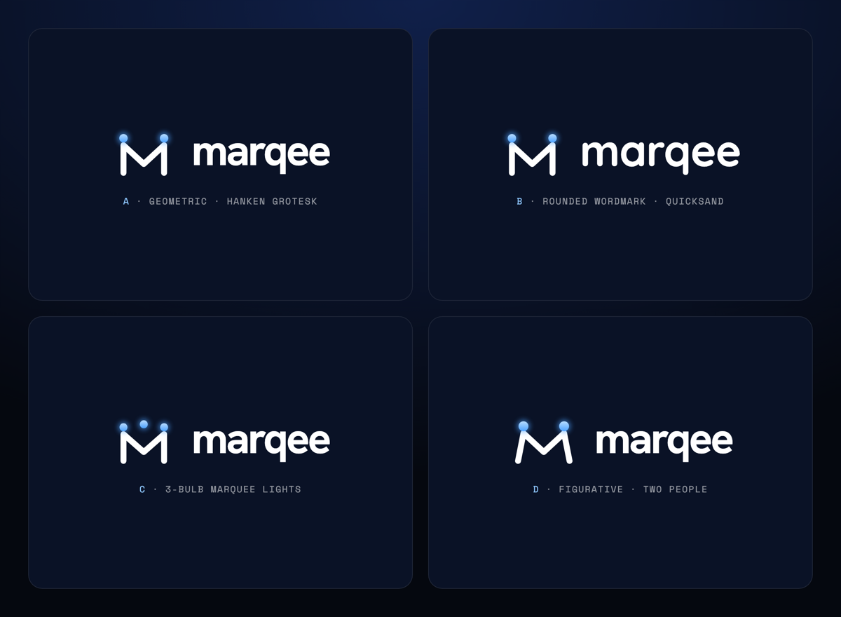
Custom horizontal lockup and stacked variant. One file, shipped everywhere. Never redrawn per surface.


Mark
The M under lights. Used at favicon size, as the app icon, and anywhere the full wordmark cannot breathe.


App icons
PWA and Apple touch outputs, all rendered from the same source mark. Real files shipped from marqee.com/img/brand/.





Palette
Extracted from the production stylesheet at marqee.com/assets/app.css. Two brand blues, an aqua family, ink for surfaces, and a light stack for the body sections.
The full production ladder also includes a pressed blue (#1F52D8), body text greys (#3C4356, #5B6472), and a hairline (#E4E8F0) used on card borders. Every surface pulls from this set. New colors require a review of the whole stack.
Type ladder
Three families, three jobs. Set in the same weights the production site loads from Google Fonts.
700 / 800 · clamp(44px, 7vw, 92px)
letter-spacing -.04em
400 / 500 · 17 / 28
color #3C4356 on light
400 / 700 · 11 to 12pt caps
letter-spacing .1 to .22em
Voice
Five principles from the internal voice guide. Every headline, dashboard string, and email is auditable against these.
01
Premium, not flashy
Confident and calm. The concierge, not the carnival barker. No hype language, no revolutionary claims.
02
Human and warm
Real people, real strategist. We and you. Empathy for how brutal the search is, without pity.
03
Outcome led
Interviews and offers, never application volume. The only number that matters is the one that puts a member in a room.
04
Plain and specific
Short sentences. Concrete nouns. Proof of work. Show the strategist tailoring the resume, not the abstract system doing it.
05
Quietly confident
Punch up at the old way of applying, never at a person, and never at a named rival. Contrast approaches, not brands.
06
The marquee metaphor
Out of the pile, into the lights. Top billing. Your name in lights. Reserved for outcome moments; kept out of utility copy.
In production
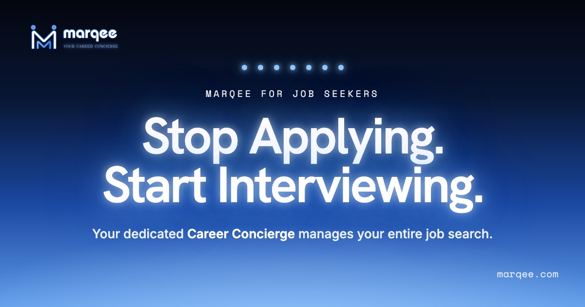
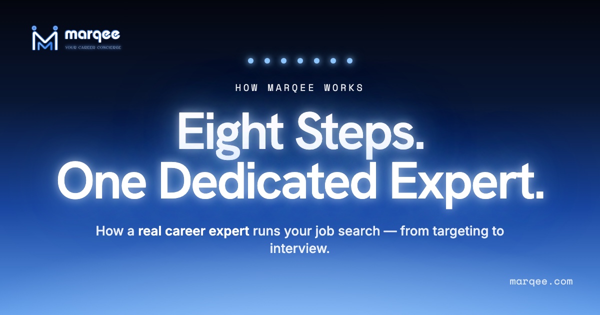
Screenshots exported from live marketing pages at marqee.com. Same tokens, same type, same voice.

Positioning, in one paragraph
Marqee is a premium career partner. Real strategists find the roles a member should be applying to, tailor the materials, run recruiter outreach and referral discovery, and submit every application on the member's behalf. Members watch the work happen in a private room, approve what goes out, and land interviews. Billing is weekly. There is no lock in. The whole company is organized around one hierarchy: people first, process second, software in the engine room. That hierarchy shows up in the wordmark, the palette, the voice, and every line of copy on the site.
Interested in similar work? Tell me what you are trying to move.
Start a conversation